Hi! I've Always Seen You Around The Sonic Community And I Decided To See Your Other Art And I Am In Love!
Hi! I've always seen you around the sonic community and I decided to see your other art and I am in love! especially with Faust! He's living in my mind rent free!
Hope you don't mind me asking, what's the secret behind how you draw paws? they look so meaty (at least Starline and Faust's) and I love it!
Hello!! Thanks to Twitter's 'For You' page I've been coming across A LOT of sonic stuff, it's quite tragic and I'm sorry /j
I'm very glad you are liking with little horrible bat man! <3 (This is not really /J, he is kind of a mix of the worst kind of people except covered in loser and gay energy) Hope you are ready to see more~ Now! Today has been an exceptionally good day so let me use my energy to whip you some simple tutorials!
There's two main ways I draw paws! I think I've given Starline both of these kinds, meanwhile Faust almost exclusively is drawn with the second method.
First, the more soft, cute type!

And then this type when I want it to be sexy or uncanny or scary (or all of the above)

Those are a bit wonky here and there, but it's a bit late right now and my wife will get mad if i let my soup get cold~ Hope those help!! If they're too small you should be able to 'right click and open the image in a new tab~
Thanks a lot for the message =D <3 Love getting those
More Posts from Aether1984 and Others
hope this isn't too annoying but you do have any tips for drawing teeth? i l o v e the way you draw them but i can't seem to draw fangs that well :/

I've seen some amazing tutorials for teeth which explain much more about how teeth fit in the skill, which is very useful! But this is a very quick explanation of how I do Teeth! I don't often outline teeth too hard, unless I'm doing tusks, since the gums and teeth edges suggest pretty well without em!
Could you please show us how to draw faces with nice fangs please.

Hope this is helpful!
do you have any tips for anatomy?? the way you draw bodies flows so well and looks so natural, but its also really detailed!!
Thank you!!! There is too much to say on the matter so I summarised some basics. The best way to learn is to draw nudes (looooots of nudes), but I hope those tips make the process easier ~


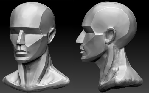
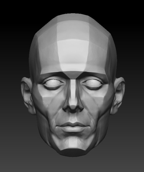

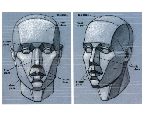


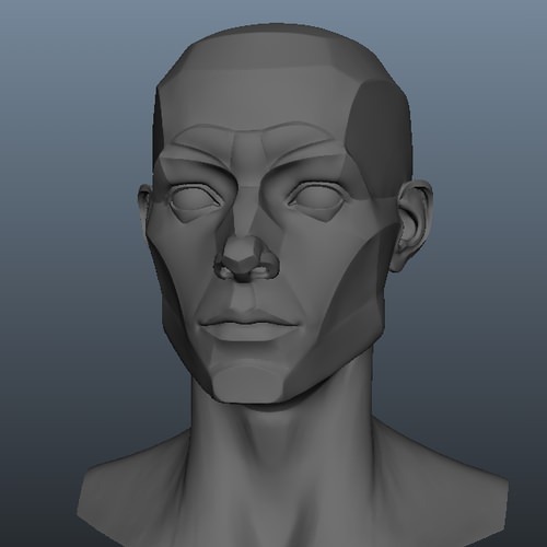

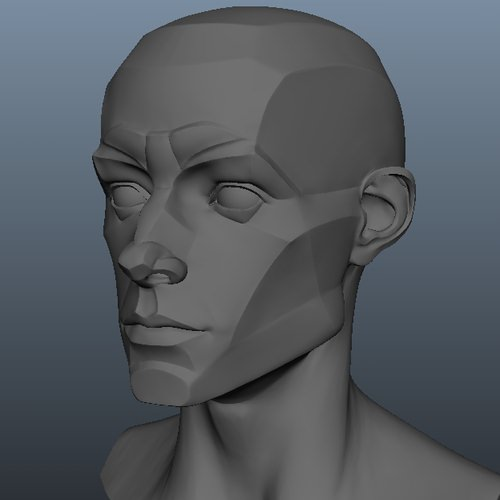
Planes of the Face Row 1 Row 2 (Lleft, Right), & 3 Row 2, Right Row 4 Row 5 Row 6,7, & 8
Making this guide because I see this question time and time again on here. This post is mostly directed at white artists and writers who are wondering how to best design their characters of color. Full text description is at the end under the cut.


Full disclaimer, I am biracial (mixed E/SE asian and white) and grew up in majority poc communities, but I am just one person and this post is only based on my own experiences. If any other poc want to chime in, feel free to do so.
Once again, a full plaintext description is under the cut. If you find the information useful, please pass it on by reblogging <3
(Finally, even though I spoke vaguely on genetic inheritance, this is NOT the place to comment on certain features being mutations, as if being a mutation means something is inherently lesser or isn’t supposed to exist. Mutations is everything! All of our traits were at some point or another, an emerging mutation. Love yourself ^__^)
Keep reading
Although I dont have anything to submit, (and the submit seems closed anyway.) Do you have any tips on how to draw suits? Ive used references, but I still dont feel like I have the hang of it.
This was from a while back but I’ve gathered some suit references to help! aaa.
Drawing suits is different than “regular” clothes, I guess, because there’s a specific way for them to look. Very sharp and angular! So when I block in creases, I tend to use triangular or boxy shapes instead of soft curves, to give it a crisper look!

I also don’t use TOO many creases because that can muddy up the simplified style I tend to work in. For more realistic styles, or detail-oriented styles, definitely look towards something like this:


SOURCE:
(hakubi8888 on Twitter has fantastic suit reference)
(Same person. This is their blog; only japanese but you can glean most of it from auto-translation)
An exercise you might consider doing is taking a pillow you’ve got and twisting or punching it a few times, then drawing the outcomes. The pillowcase has a sheen to it that looks like suit fabric. Although it might be a bit thinner than a suit fabric, you still get that cloth fold you can practice from!
-Mod Future (ko-fi)


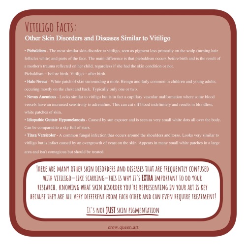
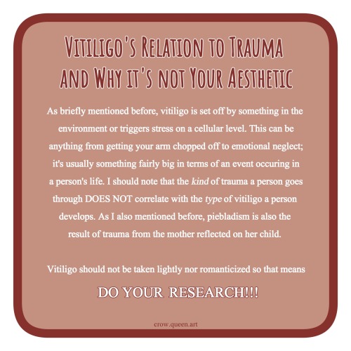
Please share this!!!!! As you resident vitiligan and fellow artist I am here to educate people on how to properly create a character with vitiligo and other things to keep in mind about the disorder.
Only 1% of the entire world’s population has vitiligo but I see so many artists making characters with it when they sometimes don’t even know what vitiligo is and pass it off as “skin pigmentation”. Like— what does that even mean??? XD
It’s not an aesthetic and it won’t get you “diversity points” so stop romanticizing vitiligo!
Varying Your Body Types
By me, Sara D. (Heh.)
I think it’s very important for artists to vary the types of bodies they draw! Not only does it add visual interest and diversity, but different body types can enhance your characters! (Plus it’s more realistic; when was the last time you walked down the street and everyone had the same body type?) I know I have a hard time drawing different bodies, especially with men, so I’m making this tutorial to teach myself as well (I’ve heard the best way to cement learning something is to teach someone else).
So! Bodies! I’m going to use women for this tutorial because I feel they have more variety in their bodies. One of the most obvious ways bodies differ is in their amount of fat.
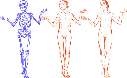


[Click here for full size]
On average, people store fat mostly in core areas like the bust, the waist, and the hips. It is important to remember that people gain and lose weight differently, and this is true no matter how fat or skinny one gets. However, these are common places people store fat:

The face and neck can be immediate indicators as to how much fat the rest of the body has; when someone loses or gains weight, it’s initially obvious in the face. This is possibly because the eye is (usually) drawn first to the face.
In addition to differences in the amount of body fat, bodies vary vastly in their proportions. The two main ways they differ is skeletally and in fat distribution. The hip to shoulder ratio is skeletal, and someone with wider shoulders might look more powerful or masculine, and someone with wider hips might look more grounded or feminine.
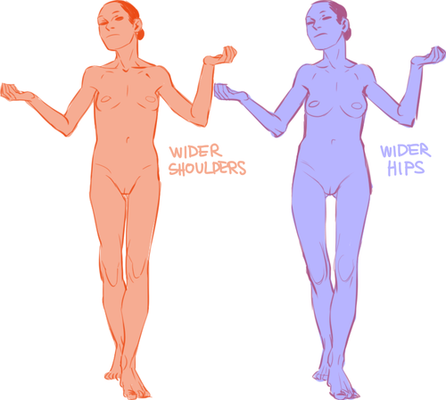
The torso to legs ratio is also a skeletal ratio. Someone with long legs in comparison with their torso might look taller than someone of the same height with a long torso, and they might also look skinnier.

(I say as I finally get some visual variety all up in here.)
Because the hips are also one of the places with the most weight gain in women, large hips can also be a matter of fat distribution. The three main places where the fat ratio really matters is in the bust, the waist and the hips (making up the core of the body).
While men usually carry weight in the belly area, the fat distribution can really vary with women. Some women carry more weight in the bust, some in the belly, and some in the hips/thighs. Some women carry more weight in two areas, like the bust and the hips, the bust and the belly, or the belly and the hips. Some women show no obvious bias to any area and carry weight equally.

[Click here for full size]
Taking into account skeletal ratios, fat distribution patterns, a vast human weight range, muscle tone and age, there are endless permutations of body types. It would be a shame if you used only one!
Oh, and that first image looks really interesting as a gif.
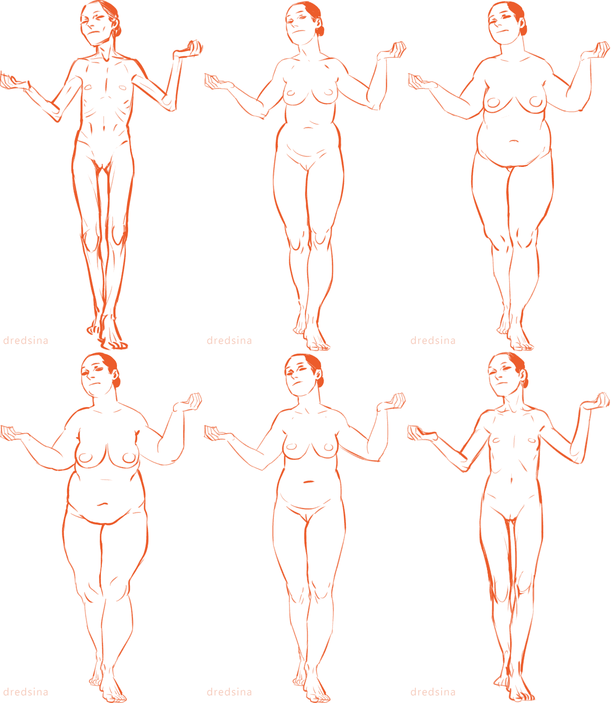


i present to you, TORSOs. heads an legs got lost in the mail sorry
Some advice for if you’re having trouble drawing hands proportionally, for basic pictures–
Put your own hand on your face, with the heel of your palm on your chin. Pay attention to the overall width, and where your fingertips and knuckles are. Then draw a rough outline of the hand over the face you’re drawing, and match the proportions to yours. You can adjust up or down a bit from there if you feel the need, but that should be a good base visual.
-
 rochaio liked this · 4 months ago
 -
 citron-elevator liked this · 7 months ago
 -
 joolishfoolish liked this · 9 months ago
 -
 onepokerhen reblogged this · 10 months ago
 -
 onepokerhen liked this · 10 months ago
 -
 pigeon-noises liked this · 1 year ago
 -
 keikoyume liked this · 1 year ago
 -
 gabriel-wolf-fox liked this · 1 year ago
 -
 cainof2na liked this · 1 year ago
 -
 isissofia26 liked this · 1 year ago
 -
 jack-hambjer liked this · 1 year ago
 -
 gogo-me liked this · 1 year ago
 -
 referenaissance reblogged this · 1 year ago
 -
 the-holy-crusade-of-an-oil liked this · 1 year ago
 -
 seelie-buddy liked this · 1 year ago
 -
 notsoinfamouzsky liked this · 1 year ago
 -
 kuthedragon reblogged this · 1 year ago
 -
 nonyanae liked this · 1 year ago
 -
 frabspam reblogged this · 1 year ago
 -
 fraberry-stroobcake liked this · 1 year ago
 -
 decaffeinated-heads liked this · 1 year ago
 -
 shadoweclipex liked this · 1 year ago
 -
 sardonyxsroom reblogged this · 1 year ago
 -
 aether1984 reblogged this · 1 year ago
 -
 shadowdeer13 liked this · 1 year ago
 -
 ginevrina liked this · 1 year ago
 -
 cartooncreaturelover liked this · 1 year ago
 -
 skeletonsmoothie reblogged this · 1 year ago
 -
 skeletonsmoothie liked this · 1 year ago
 -
 brainisrotting liked this · 1 year ago
 -
 sauriany liked this · 1 year ago
 -
 all-consuming-rot liked this · 1 year ago
 -
 sweetcreme liked this · 1 year ago
 -
 icbrothers liked this · 1 year ago
 -
 slogbait liked this · 1 year ago
 -
 maskt liked this · 1 year ago
 -
 mcmackelster liked this · 1 year ago
 -
 zeick-geist liked this · 1 year ago
 -
 anti-solidcoffee liked this · 1 year ago
 -
 psycho-chair liked this · 1 year ago
 -
 bigdumbwolf liked this · 1 year ago
 -
 fizuri reblogged this · 1 year ago
 -
 feeshyscrap liked this · 1 year ago
 -
 cleptomanicrow liked this · 1 year ago
 -
 plasmaelf liked this · 1 year ago
 -
 bix-box reblogged this · 1 year ago
 -
 bix-beans liked this · 1 year ago
 -
 irlyoshikage liked this · 1 year ago