Sorry For The Disorder, But I Wanted To Ask If You Could Do A Tutorial On Lineless Art! By The Way, Nice
Sorry for the disorder, but I wanted to ask if you could do a tutorial on lineless art! By the way, nice art!!!
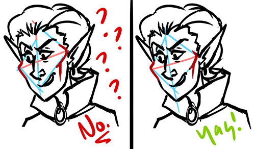
thanks! lineless art it is, then
i start with the sketch, obviously. since you won’t have the lineart to guide you later, a clean and detailed sketch is pretty important

then i make it transparent enough so that i could focus on the shapes, but was also able to tell the details of the sketch, and pick some background color

then i slap on the colors i wanna use. the accuracy of these splotches of color depends on my mood and patience and the amount of details in the drawing (lol), so it’s fairly arbitrary i guess
the more accurate it is, the less it takes to clean it up later, but the opposite sometimes adds life to the drawing and welcomes the experiments with the colors and shapes
if there’s something that needs extra accuracy (like the earring here) or i just don’t feel like cleaning it up again later, i use several layers (face, hair, etc) or add the details later. but i love using one single layer whenever possible

aaand then i just start erasing / adding stuff to make it all nice and crispy!
there isn’t really a certain point when i start doing it. like, here i added those light hair streaks before defining the shape of her head, so that i could erase the messy parts altogether, but i could also clean up the head first, then lock the layer and add the streaks

when i decide that it’s comprehensible enough for me to work without the sketch, i hide its layer. you could continue working with it, of course, but i find it distracting. it’s nice to take a fresh look and figure out what it’s gonna look like in the end

details time! i enjoy adding lines here a lot, it’s really not the same as creating the lineart beforehand. there’s something comfy and lively about this process, because you compliment the shapes, silhouettes and color rather than just redrawing the empty carcass of a sketch. besides, it adds more definition and movement to the shapes

hope that helps!
More Posts from Aether1984 and Others


A lot of people ask me for tutorials. I guess this counts. I don’t really know how to tackle a full tutorial just yet. Styles range so much that I feel it’s more just tips or suggestions
I'm a little confused. If it's racist to depict characters with noticeable epicanthal folds, then doesn't that imply that the epicanthal fold is considered an ugly feature by the person making the criticism? Seeing as it's a normal feature that many asians have...I can understand not wanting it to be exaggerated into a racist caricature, but leaving it out entirely? That doesn't rub you as being a little "Look, I left the East Asian features out so they'd be pretty!"? Which is racist in itself?
i’m assuming you’re referring to my we bare bears example. first of all, drop the ‘gasp you’re actually being racist against yourself??’ tone. i’m fine with dialogue but i have asian perspective and experience. be respectful.
no one said it’s racist to draw epicanthal folds. if your art is more realistic and detail-focused, it makes sense to include different kinds of eye folds. but in a cartoon, non-epicanthal folds aren’t translated. it’s not like you see little lines above a white person’s eyes. they’re just the typical round style. so it makes sense that the element of eye folds are left out entirely when it comes to all depicted races.

i used we bare bears as a good example because it’s the rare time asian characters’ eyes actually fit in with the style. they don’t need to squint, or be abnormally small, because no one else’s eyes do that. i don’t care that chloe has big eyes, because she’s a kid and everyone else, regardless of race, is similar. it matters more to me that her heritage is shown and celebrated rather than her having token asian traits.
sometimes cartoons can give asian eyes a lil difference and that’s fine too! candy from gravity falls has wider eyes, but they’re still round and cartoony. it’s a noticeable aberration from the style but it’s a small and harmless detail.

total drama, while not the uh, best example for a lot of things, has a great angular style. a lot of characters (gwen, izzy, duncan) have smaller eyes while not being asian. so it makes sense that heather, a polynesian character, has a bit of a half-circle shape to her eyes. it shows a diversity of eye shapes and sizes without focusing on racial stereotypes.

but ‘everyone has big eyes except the squinty asians’ happens. a lot. take trixie from the fairly odd parents. everyone’s eyes are round and big. hers are half circles, like 40% the average size. if her eyes are ‘accurately’ shaped, why does everyone else get identical cartoonish circles?
disclaimer: i grew up idolizing any representation i found, and i liked trixie a lot. and for children, it’s not the end of the world if exclusively asian characters are given small eyes. but it’s clear that she was designed by non-asian people, and there is always room for improvement.

onto more realistic art! when it comes to stereotypically limiting asian design vs. respectfully showing asian diversity, _ket2 put it best.


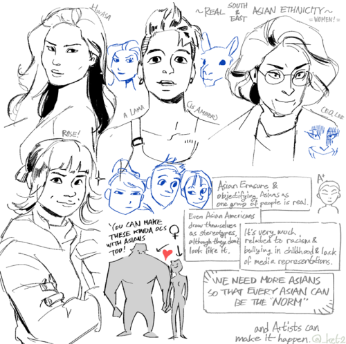
in conclusion, if you’re going to draw asian characters, don’t make them all have the same ridiculously small eyes compared to everyone else. asian people, especially artists, have been saying this forever.unlearn limiting racial preconceptions. learn from references and how diverse people look in real life.
As far as I can see you've found my refs helpful. Here's one more)

PS: Hope someone will notice this post too, not only previous, hah.
Could you do a tutorial on how to draw body hair? like chest hair, arm hair, facial hair? I can never make it look right : (
here’s a short little one:


I’m sure there’s better ways out there, but this is how I do it!
hey so i looove body horror monster stuff .. and i noticed u do too.. i wanna draw stuff like that but i always end up unhappy with it, SO do u have any good blogs/things for inspiration/tips and also what kind of body horror monsters r ur faves and what kind of stuff do u like to see in that kind of art... write me a paragraph idc i just want inSPIRATION thanks <3
http://guydavisart.tumblr.com/http://deadwooddross.tumblr.com/http://dimetrodrawn.tumblr.com/http://empartridge.tumblr.com/are all good artists for body horror… I would also look up some of the monsters in things like guillermo del toro’s movies and more recent cartoons like steven universe/ adventure time/ over the garden wall
a lot of 80s horror has a lot of good body horror, see movies like The Thing, The Gate, The Company of Wolves, etc.


I would also look at horror movies for a younger audience as they tend to rely more on surrealism and body horror due to not being able to show a lot of blood


(limbs that are just way too long are /great/ by the way)video games imo tend to have pretty good creature design compared to movies, especially ones with simpler graphics. I really like the amalgamates in undertale, for instance:

(the endogeny is a really good example of ‘less is more’… a lot of times, a lack of features, like no eyes or a face that’s just a hole is much more unnerving than adding way too many eyes and spikes)

The designs also take advantage of a minimalistic art style to let the viewer make up some of the body horror… it’s hard to make sense of where everything begins and ends here, and given the character is a melting mutation, the negative space + vagueness is really effective


OFF also has some really nice monster designs… it also takes advantage of a lack of features (most creatures have no or blank eyes) as well as giving a lot of the creatures too many teeth, which always looks scary and wrong imo. Especially if they’re drawn crowded instead of spaced outlower poly monsters are also weird and nasty, possibly because their lack of more than like three angles makes them look super uncanny. there’s just something about flat surfaces + textures…:

human features on non human things are really cool:


people hands on something that’s just terrible and monstrous is just so gross and fun. hands are the worst. teeth are good too. with the second picture here, asymmetry is also adds a lot to the design; it’s very clearly not a natural creaturealso look at real world animals if you can! a lot of fish are weird, things like pink river dolphins and naked mole rats are pretty freaky looking.. leopard seals and their mouths… cordyceps on insects…but yeah, I think the best things you can do with body horror personally is exaggerate features (really jutting necks are super weird, for instance) and pick traits you think look horrific (a lot of people don’t like clusters of holes in the skin, teeth where they shouldn’t be, etc.)
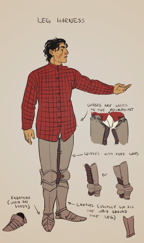
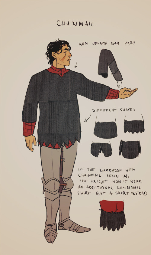
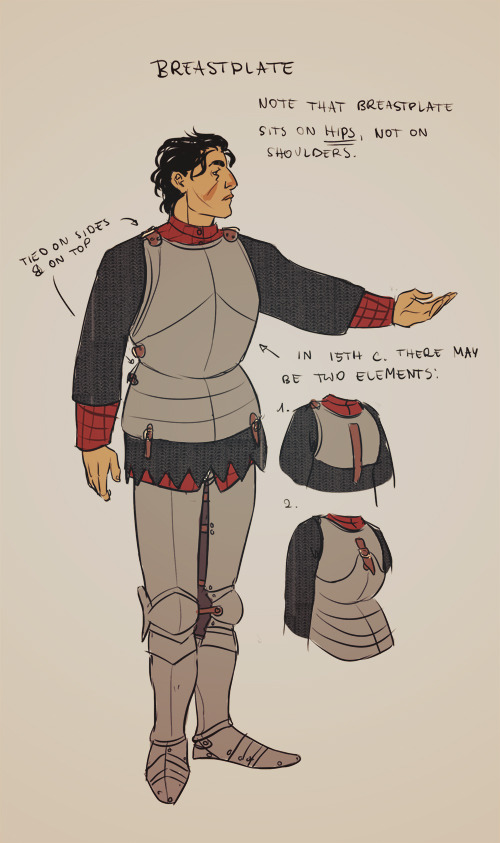
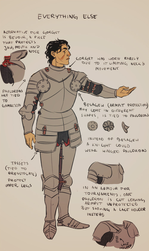
There’s always space for yet another armor tutorial, right? (ノ´ヮ´)ノ*:・゚✧
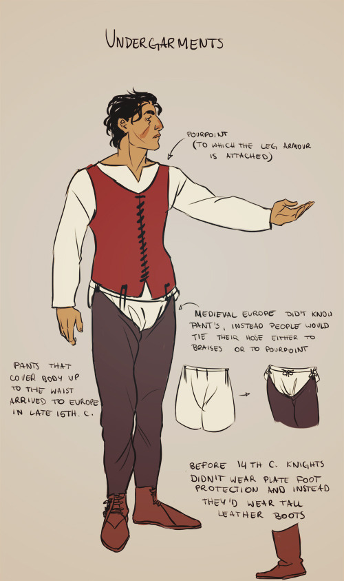
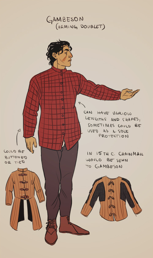
Note that the armor I drew would be worn around 15th century, the more into the future the less and less components knight’s armor had (i. e. in early 14th century instead of greaves a knight would wear long boots only; in 12th century knights didn’t wear plate breastplates and instead a chain mail only). Also the design of armor pattern changed by year and was different in every country (i.e. in eastern Europe armors, while still looking European, were heavily influenced by Turkey). so just make sure you always do research whenever drawing an armor. And one more thing to keep in mind is that armors were expensive, knights wearing a full plate armor weren’t an often sight.
Some links that may be useful:
Armour Archive (I strongly suggest to browse its forum, there is no country or period of which armor wouldn’t be discussed)
Therion Arms (armorer’s page; each accessory is photographed in big resolution and several time so it’s a nice page to use as reference for drawing)
Revival Clothing (another store, but both with medieval clothing and armors; I suggest to read the articles, they’re often supported with pictures)
Basic Armouring:A Practical Introduction to Armour Making (pdf)
Educational Charts (pdf, shows how armors and weapons changed over the years)
Medieval & Renaissance Material Culture (actual medieval resources, mostly paintings. And my favourite subpage - women in armor)
Dressing in Steel (youtube; a demonstration how to dress in armor)
How shall a man be armed? (youtube; another demonstration but with 4 different knights from different periods)
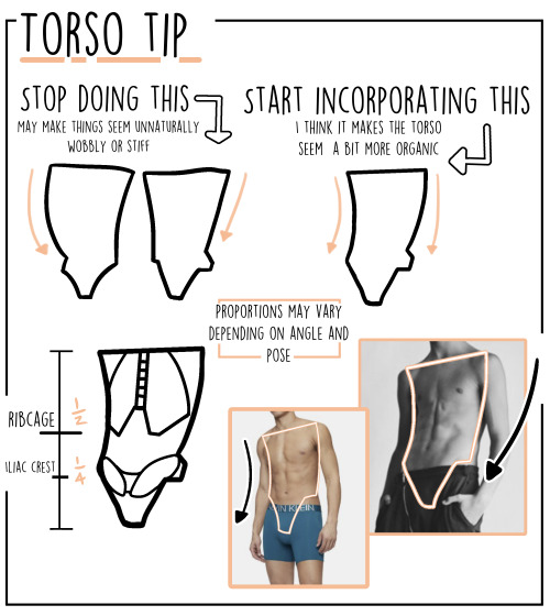
Eh, just a lil’ something.
“ Where we’re going we don’t need proper proportions “
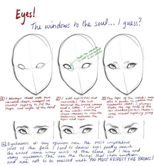


I finally reached 5000 followers *quietly cheers* and @strongity asked me a day before that happened to maybe do a tutorial thing on eyes and anatomy… So I did my best. I have kind of moved past using methods to draw (like using boxes to create shapes), just because I’m so used to drawing people. It kind of became a tips thing rather than a step by step guide, but hopefully it will help some of you!

yee! ill put this under a cut bc its long and features eye/body horror
also this turned more into me rambling abt using uncanny valley srry if its not much help fjdsjf
Keep reading
Drawing Heads and Faces: Cheekbones

I’ve found that drawing the head starts to make a lot more sense once you start thinking about cheekbones and cheeks, and how the fit into the head structure.
You might be aware of the Mysterious Indent that Looks Good Next to the Outer Part of the Eye, or the Mystery Indent for short.
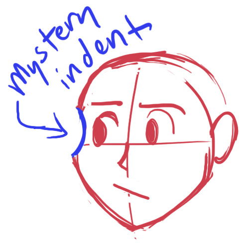
Drawing a Mystery Indent may serve you fine if you only draw the head from flat angles, but it falls apart when you get adventurous.

Why isn’t this making sense anymore?
Drawing a ‘Mystery Indent’ is an attempt to imply cheekbones without knowing how they actually incorporate into the skull, and this is why it looks so unconvincing when you use it to draw the head in anything other than ¾ view.
The cheekbones wrap around the head and eye sockets from above the bridge of the nose. The concave you draw if you draw the ‘Mystery Indent’ is a misunderstanding. There is no concave. You should instead be thinking of this as where the eye socket/brow overlaps the (convex!) cheekbone.


Compare the cheekbones on both sides for placement. They should match up and correspond with each other.
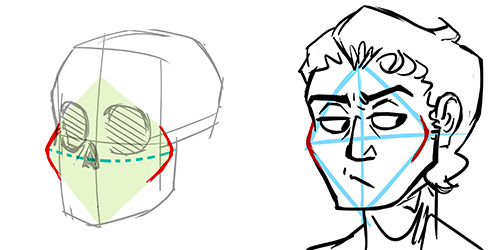
(Knowing cheekbone structure helps when drawing gaunt characters, because their cheekbones may stick out. Remember to compare the cheekbone placement on both sides!)
* This is part of a much larger tutorial I’m working on about head, face, and facial feature structure. Hopefully more to come eventually?
-
 mickeysartrefs reblogged this · 5 months ago
 -
 artking-4 reblogged this · 8 months ago
 -
 twadi-gurl reblogged this · 1 year ago
 -
twadi-gurl reblogged this · 1 year ago
-
 diyugemma liked this · 1 year ago
 -
 mickey-art-refs reblogged this · 1 year ago
 -
twadi-gurl reblogged this · 1 year ago
-
 starredforlife liked this · 1 year ago
 -
 miserylovesbees liked this · 1 year ago
 -
 brieflyimpossiblecreation reblogged this · 1 year ago
 -
 cleverhumancostume liked this · 1 year ago
 -
 aluc-art liked this · 1 year ago
 -
 thelunarmouse liked this · 1 year ago
 -
 sasukebutmorebratty liked this · 2 years ago
 -
 lazybutnotalazygenius liked this · 2 years ago
 -
 sonicfan8967 liked this · 2 years ago
 -
 hsusejrmt reblogged this · 2 years ago
 -
 classicteacake liked this · 2 years ago
 -
 candyvoncaramell reblogged this · 2 years ago
 -
candyvoncaramell liked this · 2 years ago
-
 ikolit reblogged this · 2 years ago
 -
 interdimensional-chaos reblogged this · 2 years ago
 -
 gorefolk liked this · 3 years ago
 -
 detertakesmanhattan reblogged this · 3 years ago
 -
 incineroarenjoyer liked this · 3 years ago
 -
 elrazy liked this · 3 years ago
 -
 onedayimgonnausethese reblogged this · 3 years ago
 -
 lutzart97 liked this · 3 years ago
 -
 girthiest-girl-dick liked this · 3 years ago
 -
 cupidscythe liked this · 3 years ago
 -
 justplaggin liked this · 3 years ago
 -
 jaxisntdoingartthings liked this · 3 years ago
 -
 80scartoon liked this · 4 years ago
 -
 sand-undertable reblogged this · 4 years ago
 -
sand-undertable reblogged this · 4 years ago
-
sand-undertable liked this · 4 years ago
-
 manic-pixie-dream-dude liked this · 4 years ago
 -
 forthegloryofmorgana liked this · 4 years ago
 -
 tastiiiiiiiii liked this · 4 years ago
 -
 nutterbu liked this · 4 years ago
 -
 freeranchjudgeskeleton liked this · 4 years ago
 -
 thingything reblogged this · 4 years ago
 -
 sukinayomi reblogged this · 4 years ago
 -
sukinayomi liked this · 4 years ago
-
 donttouchthevoid liked this · 4 years ago
 -
 airesblu liked this · 4 years ago
 -
 phantom-black liked this · 4 years ago